aura: brand book
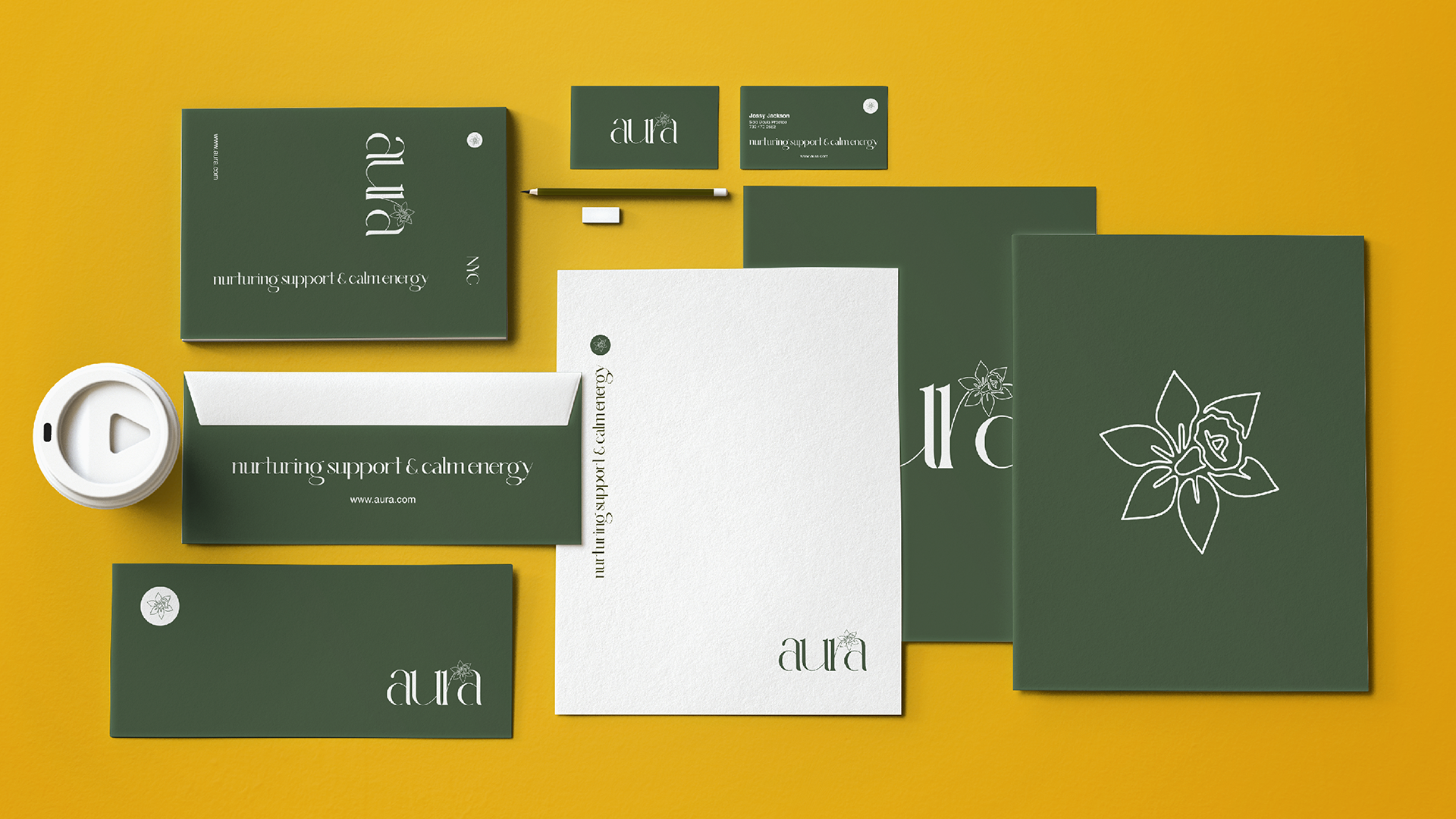
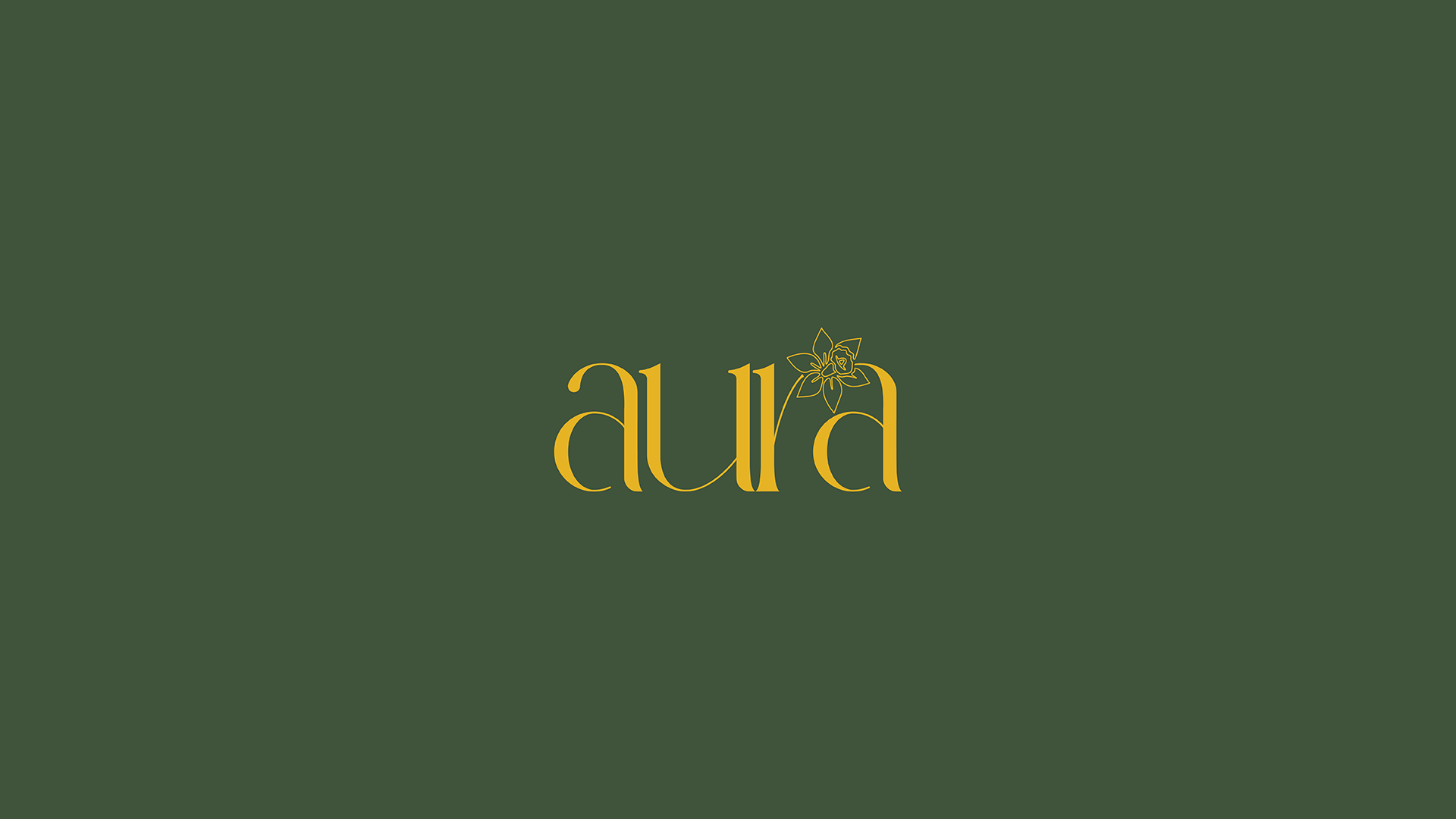
To embody nurturing support and calm energy, we have chosen to pair the brand name with a daffodil, symbolizing renewal, joy, and hope—qualities central to the brand’s identity.
Additionally, we selected the classic-modern serif typeface Oleragie, which blends old-style elements with a slanted serif and high-contrast strokes for a sophisticated, contemporary look. This typeface lends a sense of elegance and trustworthiness to the brand, enhancing its appeal.
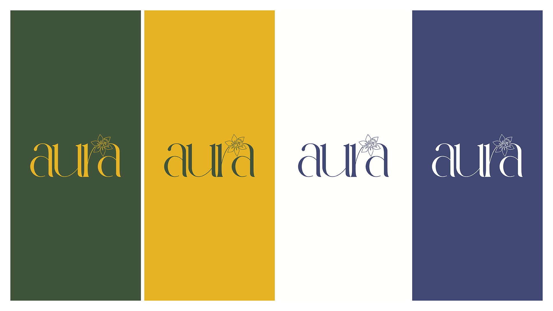
Finally, the primary logo allows the daffodil to be used as a versatile brand symbol that complements any graphic piece designed.


